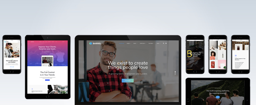
Every year, web developers try a slight change in the website design approach and soon it turns out to become a trend. With three months of the year already gone, many new trends have emerged till now. According to web design experts, 2017 is presumed as the year of content layouts that dominate big and bold typefaces with bright backgrounds.

Keeping in mind this context, typography becomes even much more essential and crucial element that is responsible for catching visitor attention. A web designer should be aware of various typefaces that are not just appealing, but have potential to attract visitors.
Some of the unique fonts that are going to rule in 2017 are:
-
Akrobat:
This is a free modern sans serif font designed by Plamen Motev. It supports condensed proportions and comes in eight weights. Akrobat features geometric aesthetics and neo references that makes it a perfect choice for displaying headlines, logos and text paragraphs.
-
Humger:
Humger is also a free font that supports capital letters in a grunge style. It doesn’t apply for lowercase letters and is only designed to display letters in uppercase letters. This typeface’s body reveals dirty old school effects and its shape expresses a strong urban style with characters featuring smudge effect and narrow texture. This font works better for titles, headlines and infographics.
-
Sophia:
Another free font created by designer Emily Spadoni is Sophia. This typeface is characterized by hand lettered style with sweet, saucy and shabby effects. Its package includes both lowercase and uppercase letters with a set of special symbols that are ideal to display infographics, websites and informal logos.
-
Town:
Town is a family of fonts that offer a classic feel with features like contemporary proportions, styling and detail. This font package consists of eight weights and nine decorative styles that are effective in creating bespoke logos, stylish labels and engaging website layouts. Some of the town styles can be layered to add subtle shadow to the headlines.
-
Tuna:
Tuna is a paid typeface that is designed by Felix Braden and Alex Rutten. Though it was released only few months ago, this font has already gained tremendous popularity. Tuna is a serif typeface with a calligraphic touch and is highly readable. It comes in five weights with all of them giving up italic tilts.
These are the few fonts that are going to rule the web texts in 2017. If you are looking to attract more and more users towards your website, feel free to consult our web developers at Saskatoon Tech.
